
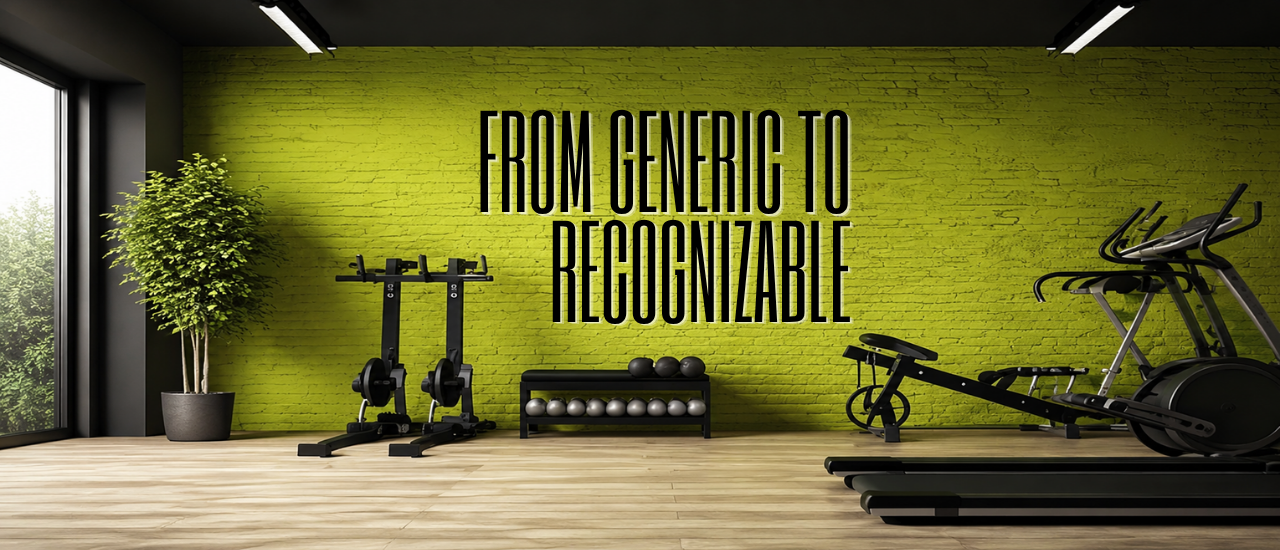
Client: A boutique fitness studio expanding to a second location Service: Branding Design Timeline: 6 weeks
The Challenge The client’s original branding was built quickly at launch — a basic logo, no defined color system, and inconsistent visuals across their website, social media, and in-studio signage. As they prepared to open a second location, the lack of a cohesive identity was becoming a real barrier to scaling consistently.
What We Did
- Conducted a brand discovery process to define the studio’s core identity, target audience, and tone of voice
- Designed a new primary logo along with secondary marks and an icon system for smaller applications
- Built a full color palette and typography system designed to work across digital and physical spaces
- Delivered a comprehensive brand guideline document covering logo usage, color codes, typography rules, and imagery direction
- Applied the new identity across a social media kit, business cards, and in-studio signage mockups for both locations
The Results
- A cohesive brand identity now applied consistently across both physical locations and all digital channels
- Social media engagement increased 45% in the two months following the rebrand launch, attributed to a stronger, more recognizable visual presence
- The client reported significantly faster onboarding for freelance designers and the second location’s build-out team, since the guideline document removed the need for repeated brand explanations
Client Takeaway “Before this, every piece of marketing we put out looked like it came from a different business. Having an actual guideline to hand to anyone — a printer, a social media freelancer, a sign company — meant we stopped having to explain our brand from scratch every single time.”